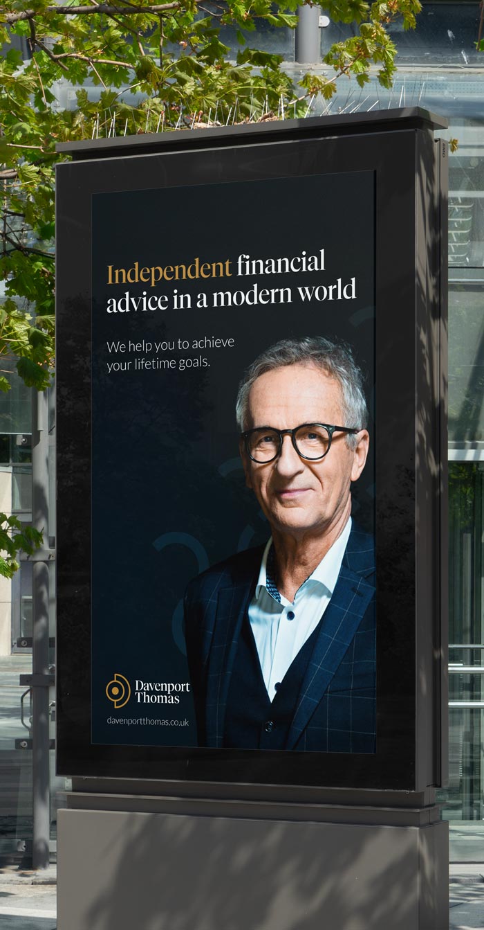
Davenport Thomas
Transforming expertise into visual trust
Overview
The client
Davenport Thomas specialises in bespoke financial services and investment advice for affluent, international individuals. Their expertise spans wealth management, risk assessment, and strategic investment planning – all focused on one clear mission: providing expert guidance that gives clients the financial freedom to achieve their lifetime goals.
Despite delivering exceptional service, their brand failed to project the confidence and sophistication their work deserved. This misalignment between service excellence and brand perception created a significant barrier, limiting their ability to attract and convert ideal clients. High net-worth individuals weren’t seeing the true value and expertise that Davenport Thomas could offer.
My role
The scope
My role was to develop a brand that projected both luxury and financial rigour – essential qualities for winning trust from high net-worth individuals. Through strategic design work, I elevated their identity to match their exceptional service quality. The new brand and website needed to clearly demonstrate why Davenport Thomas should be trusted with wealth management and complex financial decisions. Perfectly positioned to attract and engage their ideal clients.
My responsibilities:
Brand strategy & identity
Logo design
Website design
The logo
Simplicity & elegance
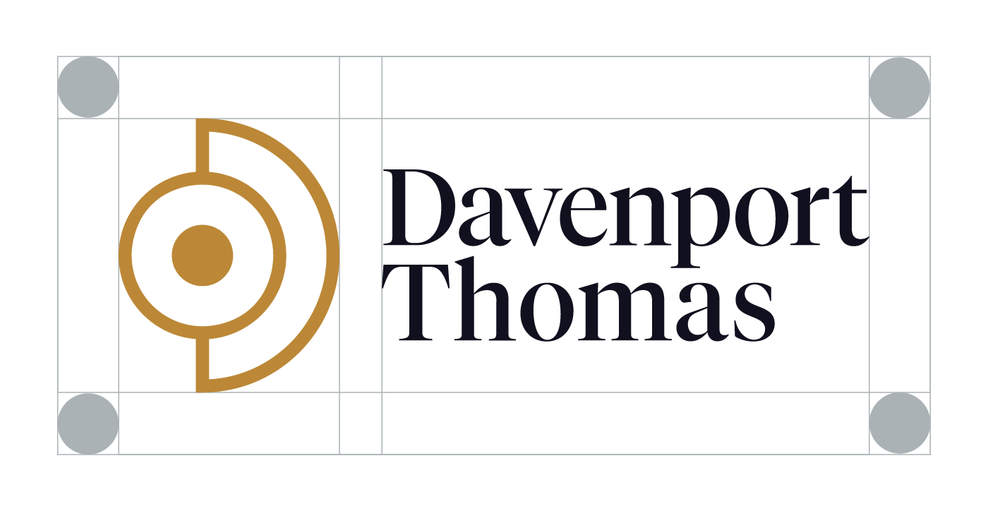
The logotype pairs a modern refined serif typeface with a considered line break, ensuring both recognition and versatility. Its accompanying symbol – clean and distinctive – merges three elements: a ‘D’ monogram, a globe reflecting international reach, and alchemical symbols for precious metals. This combination creates a mark that speaks directly to wealth management while remaining elegantly simple.
The winning concept
Refining visuals
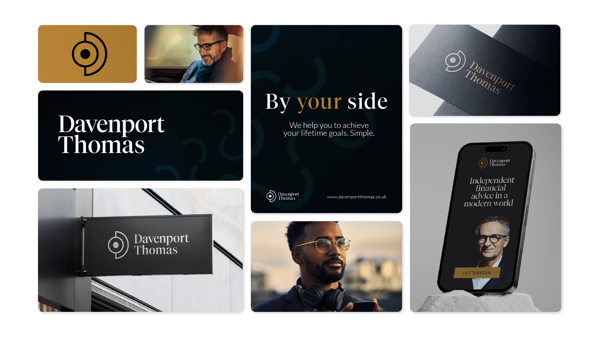
The visual system extends the logo’s sophistication through rich, contrasting colours and atmospheric gradients, creating an unmistakably premium feel. Subtle pattern work adds depth and refinement, while carefully selected photography shows content, aspirational clients captured with soft focus and warm tones. This elegant, understated design language perfectly complements the established messaging – reinforcing trust and exclusivity at every touchpoint.
Building identity
Colour
The colour palette pairs deep blues and purples – reflecting quality and prestige – with warming gold accents that signal luxury. This calculated contrast creates visual impact, while touches of light blue-grey bring balance and calm to the composition.
Midnight Blue
Golden Ochre
Etherial Blue
Deep Purple
Pairing fonts
Typography
Typography balances Tiempos Fine’s elegant confidence with Lato’s clarity. The modern serif speaks to authority and sophistication, while the supporting typeface ensures seamless readability across detailed content.
Heading typography: Tiempos Fine
Body text typography: Lora
Bringing it all to life
Website design
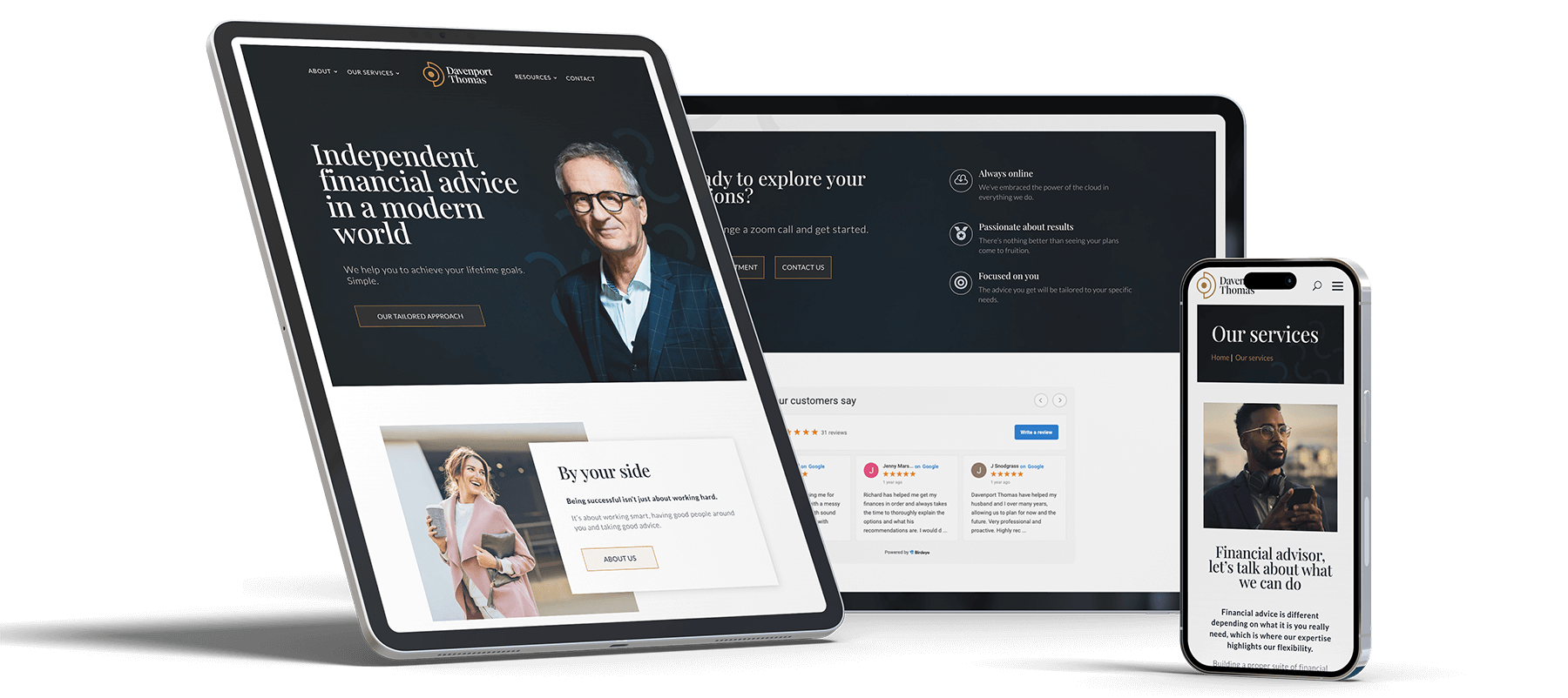
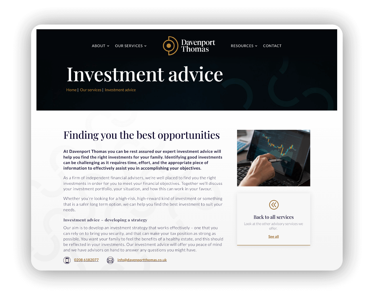
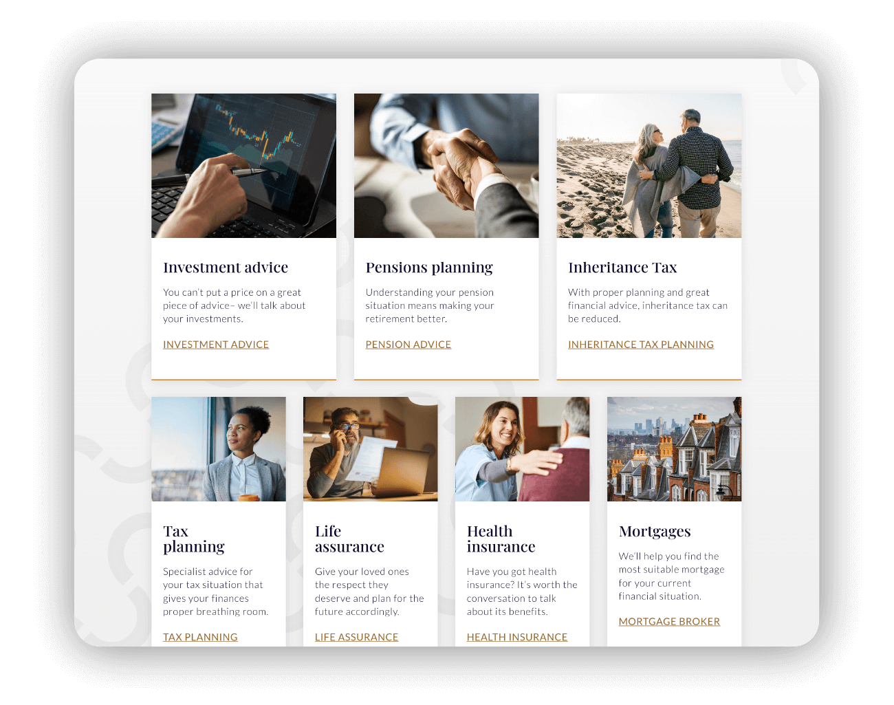
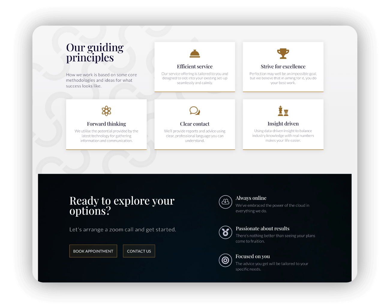
The culminating website design unites strategy and visual identity through considered UX. Clean imagery and asymmetrical layouts reinforce the brand’s sophistication at every touchpoint. With this elevated digital presence, defined positioning, and clear voice, Davenport Thomas stands ready to engage their ideal clients.
The next steps
Want to work
with me?
