PracticeWeb
GIVING AN AGENCY A FRESH DIRECTION
Overview
The brief
As the Lead Designer at PracticeWeb, I’ve guided many client campaigns to success. However, this project—reimagining our own digital presence—presented a new challenge and opportunity.
Despite PracticeWeb’s long-standing reputation for helping accountants find their voice and connect with their audience, we recognised a disconnect between our market positioning and our audience. Our team developed a refined brand strategy, sharpening our messaging and direction. The outcome made it clear: we needed a complete website overhaul.
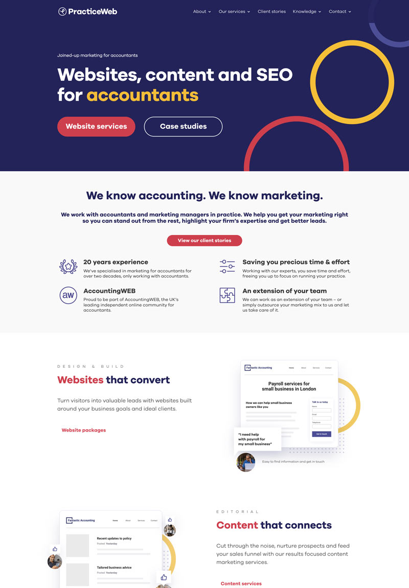
Our first step was a thorough analysis of the existing site’s performance. We delved into user behavior data, examining traffic sources, engagement patterns, and drop-off points. The findings revealed that our site wasn’t effectively showcasing solutions to user needs, lacking scannable content architecture and clear calls-to-action. The visuals also needed work. Our imagery lacked consistency in application and the human element that builds trust and relatability.
Armed with these insights, I began crafting a new digital experience that would align our strategic direction with an intuitive user experience, creating a more engaging and purposeful journey for our visitors.
The original site
Wireframeing
The gameplan
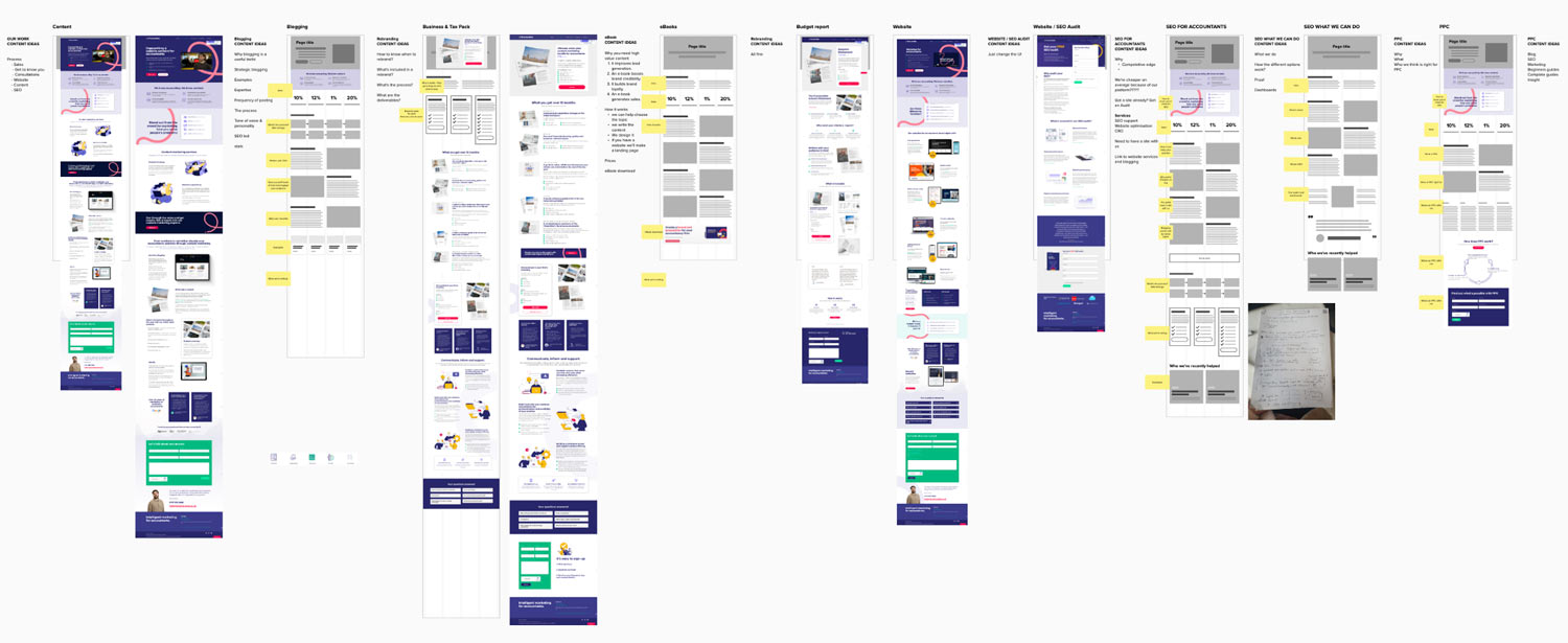
Before diving into design, I developed wireframes to strategically address the site’s challenges. This planning allowed me to map out the user journey, document interactive elements, and content placement—creating a blueprint that would bridge our strategy with functionality.
Design system
Fresh visual direction
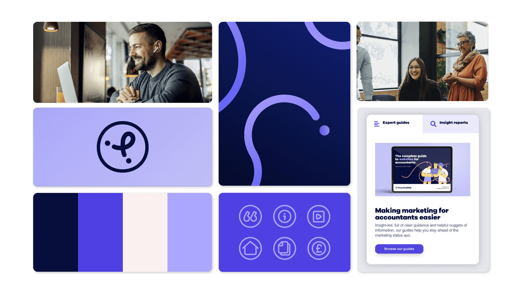
With the strategy set, I expanded the existing brand framework to create a more comprehensive visual system. This included developing patterns, refining the illustration style, and establishing a softer photographic approach that better aligned with the new voice. The UI naturally evolved from this, drawing inspiration from the established organic curves and bold colour palette.
Like most rebranding projects, PracticeWeb’s visual identity grew stronger through real-world use. What began as a core design system evolved and adapted as I applied it across different touchpoints.
Pulling it all together
Website design
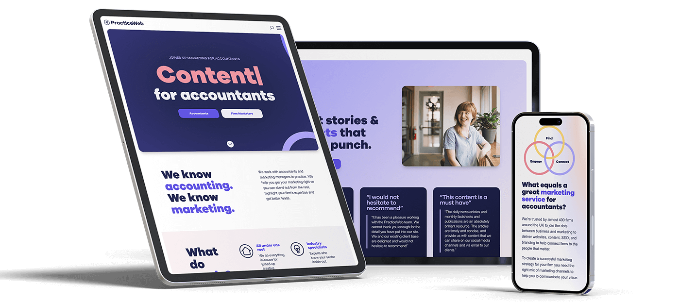
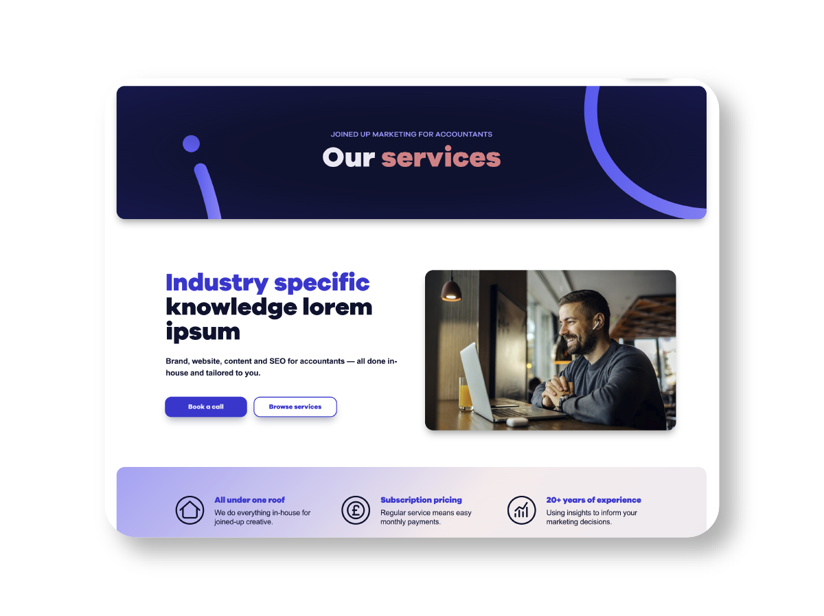
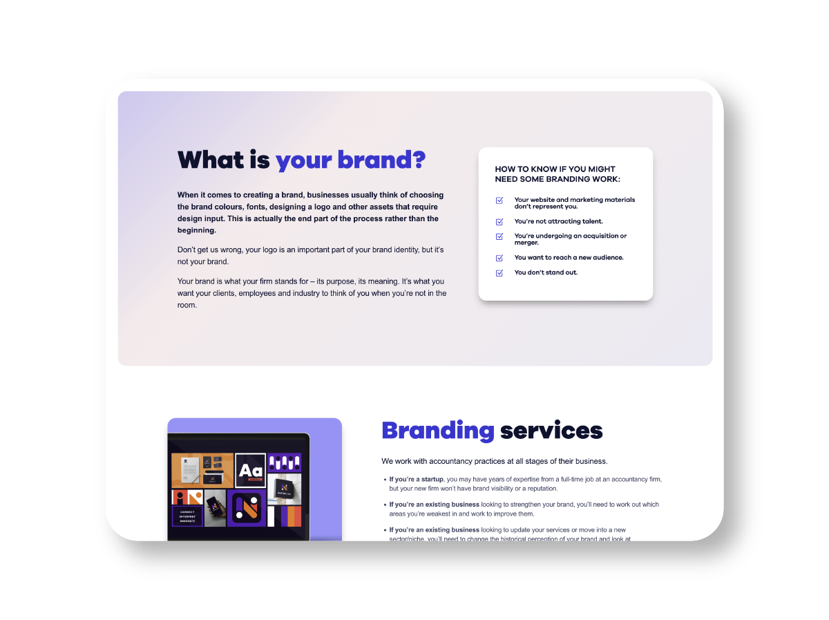
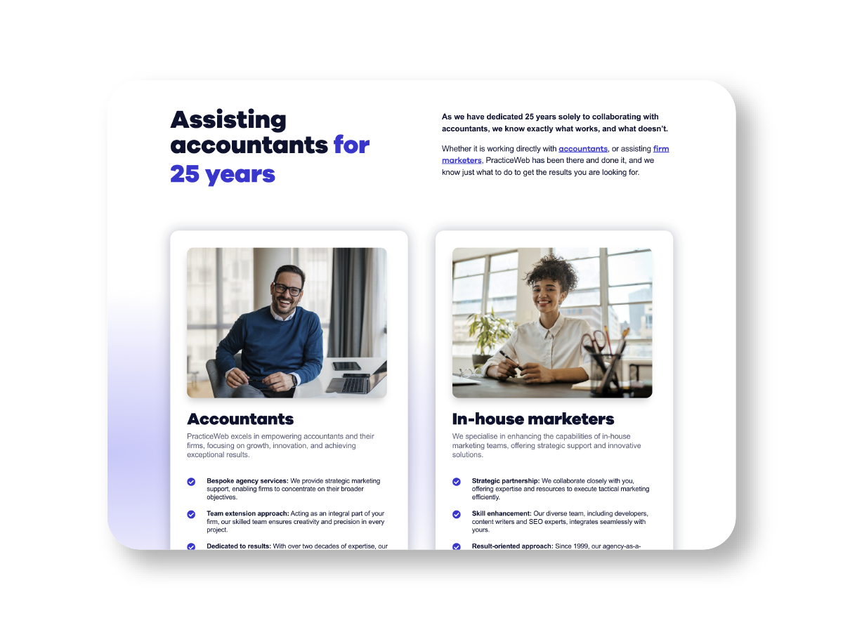
Armed with deep user insights and brand strategy, I designed an experience that puts our visitors first—carefully crafting interactions to feel natural and purposeful. The result is an intuitive website that guides users smoothly through their journey, centred around a robust content hub that makes our expertise more accessible to clients.
The redesign goes deeper than showcasing what we do. It strengthens client connections by making it effortless to find helpful resources and take action.

The next steps
Want to work
with me?

