Barley Grove
Crafting a new face for a growing business
Overview
The client
Barley Grove is a young accountancy firm, founded by two childhood friends. Their core philosophy is built on guiding and nurturing small business, going beyond traditional accountancy. They have always delivered excellent service but struggled to stand out and broadcast what makes them different.
Barley Grove matured as a business and needed their brand to evolve. The objective was to reach and convert their dream clients, by communicating they are not alone and that Barley Grove are the business experts ready to help.
My role
The scope
The aim was to provide an effective and consistant brand narrative that would help Barley Grove grow and step into the next chapter of their business. Their new brand identity would need to position them as a nurturing and knowledgable partner in business to differentiate them from their competition.
My responsibilities:
Brand strategy & identity
Logo design
Website design

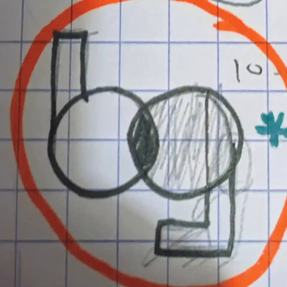
The winning concept
Making it pop
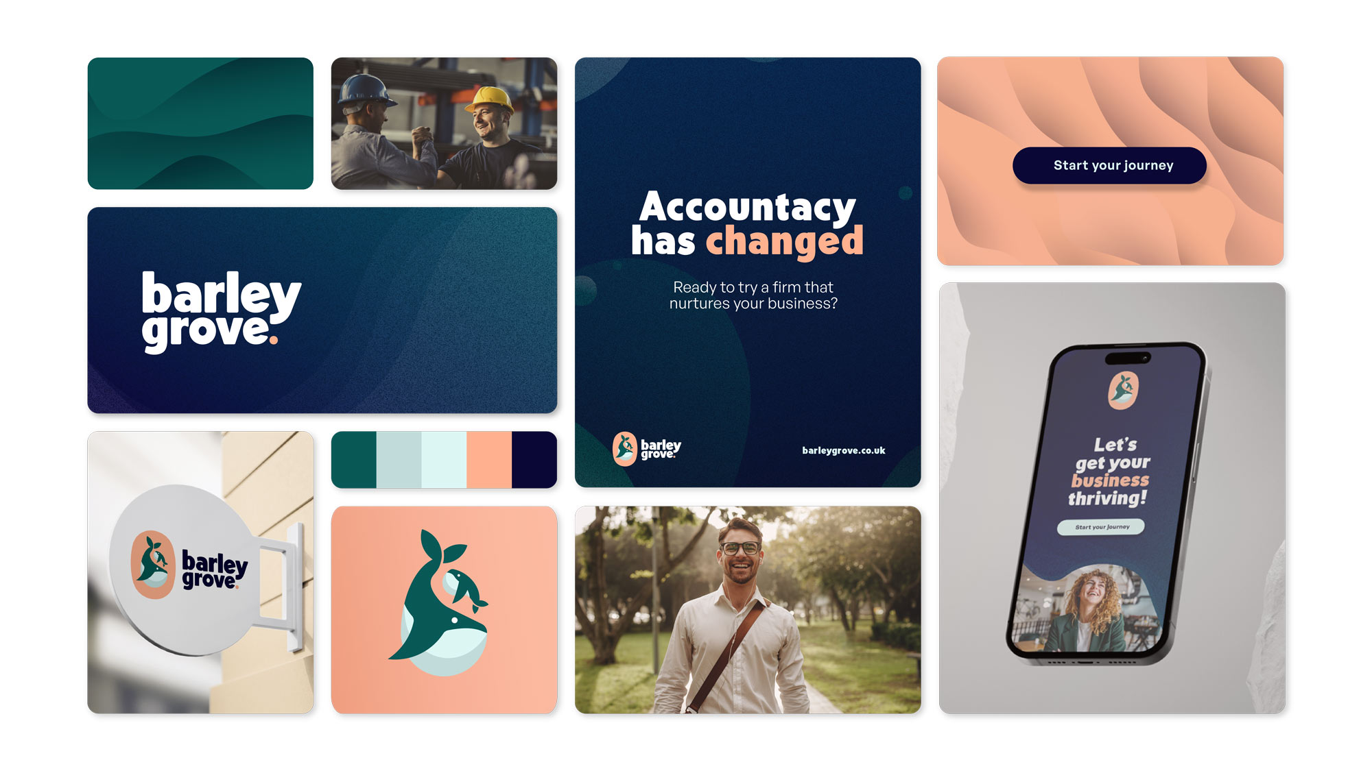
After refining the initial brand positioning and strategy I designed the logo and broader visual identity.
The brand is freindly, spirited and empowering. The logo conveys a caring and collaborative nature. Curves and textured gradients represent the ocean, giving an organic flow and a level of depth often absent in big corporate accountancy. The photography style is natural, candid and focused on happy business owners. This resonates with audiance creating a connection.
Building identity
Colour
I built the colour pallette around the logo emblem.
I paired deep rich ocean tones with a warm and calming contrast colour. This was to present Barley Grove as a welcoming, nurturing guide; a safe pair of hands in a complex and isolating business world.
The non – traditional colour pallette provides Barley Grove with visual seperation from their competition.
Deep Indigo
Stormy Teal
Warm Peach
Powder Blue
Pairing fonts
Typography
I paired Kilimanjaro sans with Open sans to communicate Barley Grove’s personality. The chunky rounded heading conveys a friendly authenticity. The body text provides ledgability and scanability in large blocks of text.
Heading typography: Kilimanjaro Sans
Body text typography: Open Sans
Bringing it all to life
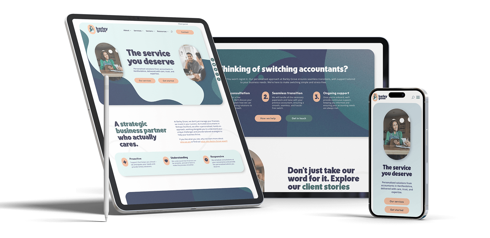
Website design
I combined the brand strategy with the visual identity to deliver a focussed user experiance. It’s designed to welcome, educate, organise and convert Barley Grove’s dream leads.

The next steps
Want to work
with me?


